The amazing story of colors
“What Color is that?”
This is probably one of the most common, ever-intriguing questions in the minds of us, human beings.
We see colors in everything – the food that we eat… the clothes that we wear… our cars…. our homes…our pets and many more.
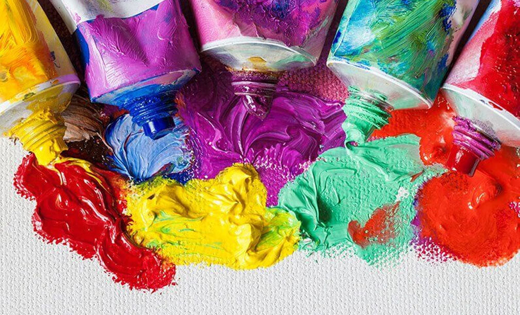
Colors are probably the first things you would ever notice when you see a painting. However, there is a lot more to color than what meets the eye.
As an artist you will have to delve much beyond naming and recognizing colors in order to use these colors, based on their inherent qualities, for specific purposes.
It is color that gives the mood, the depth and the impact to a painting. Just a tiny dab of a bright color can transform an otherwise monochromatic picture. That’s the kind of potency color can have on the visual senses of its viewers.
It was about 40,000 years ago, that the first pigments of colors were invented. A combination of chalk, burnt charcoal, soil and animal fat was used to create a basic palette that included five colors: White, Black, Brown, Yellow and Red. Ever since then, colors are being perpetually discovered either through scientific advancements or explorations. From Renaissance to Impressionism, artists have been experimenting with colors, making the inventions of these new pigments the greatest moments in the history of art.Here is a deep insight into how colors were invented and used:
Red
Red ochre is first ever pigment that was used in the pre-historic cave paintings. It was from the iron-rich soil that artists invented this material. However, by the 16th and the 17th century, the source of this pigment changed over to a white bug called cochineal insect, which was found on the prickly pear cacti that grows in Mexico. The potent red dye produced by this insect is still used in some of the lipsticks and blushes. Great artists like Raphael, Rudens and Rembrandt used this cochineal red shade to increase the intensity of red in their paintings.
Blue
Have you seen the bright blue robe of Virgin Mary? The shade is called the ultramarine blue, which comes from a gemstone called lapis lazuli. Found in a single mountain range of Afghanistan, this gemstone was much costlier than gold. Ultramarine blue became the signature color of Yves Klein, who got the synthetic version of this color manufactured through a Parisian paint supplier.
Yellow
Yellow, the most favorite color of Vincent Van Gogh and Joseph Mallord William Turner was first invented by Turner, who created a fluorescent paint out of the urine of mango-fed cows. Once this practice was banned, Turner turned over to a synthetic version of Chrome Yellow, which was actually a lead-based pigment, having the potential to cause delirium. It was this vivid hue that Van Gogh used in his ‘sunflowers’ and ‘starry nights.’
Green
Scheel’s Green is the first ever green pigment invented in 1775, by Carl William Scheel, a Swedish Chemist. Although cheap to produce, this pigment came laced with arsenic, a highly toxic chemical. This was later substituted by Paris Green, the toxicity of which is said to be the cause of blindness in Monet and diabetes in Cezanne. Understandably, the pigment was eventually banned.
Black
Although many impressionists avoided using Black, it became one of the favorite colors of American Artists like Richard Serra, Frank Stella and Ad Reinhardt. Popularly known as bone black, this pigment was initially produced by burning the bones of animals in an air-free chamber.
White
Of all the pigments that got banned, it is probably lead white that most artists ended up missing. The way this hue could reflect a gleam of light was absolutely glamorous. The manure of horses and cows were layered on a mixture of lead and vinegar and left to dry in a sealed room for a period of three months to get these pure white flakes. Once it was banned, artists like Robert Ryman, Agnes Martin and Robert Rauchenburg turned over to zinc as well as titanium whites.
The impact that colors can create depends totally on how you use them. One single color can be used to create different effects such as cheerful, somber, dreamlike, atmospheric, explosive or sensitive. In fact you can even feel these emotions when you look at these colors. Many artists have used colors to convey religious, psychological as well as emotional significance.
Colors can change the way we think, act or react. Used in the correct way, color can create the right effect and even save on energy consumption. However, if used in the wrong way, it can even irritate your eyes, suppress your appetite or raise your blood pressure.
As John Ruskin once said…. “”The whole value of what you are about depends on colour. If the colour is wrong, everything is wrong: just as, if you are singing, and sing false notes, it does not matter how true your words are.”
It is very important to understand what each color represents and how it impacts the “real world” in order to make informed decisions about creating designs that appeal to your target audience. The last thing you would ever want to do is to offend people with the designs that you have specially created for them.
The color wheel is probably the greatest gift to the world of art. It teaches us the five main rules of color, which are:
- To harmonize
- To unify a particular scene
- To create a visual path
- To bring in rhythm
- To emphasize
It is through this that we understand how to wield color in a dynamic way, without deviating from our purpose. It allows us to come out of our color biases if any and help us view things from a clearer perspective. The result can only be gorgeous paintings.
Nature is the best teacher when it comes to art. Instead of whizzing by from place to place, you need to actually stop and take in those finer details needed to paint things the way you see. So, look out of your window, take in those colors and start applying them to come up with designs that your viewers are sure to fall in love with.
Make your painting
Order Now